Bento Sushi
 Bento Sushi is North America’s second largest sushi brand providing the highest quality packaged sushi and ready to heat/made to order hot Asian food.
Process
Bento Sushi was the first major project I was assigned to when I joined the Reshift Media team. They gave me the lead role in the development of the website. I had technical assistant from Mahmoud Ghali, the VP of Technology, and additional support from Helena Boitsova, one of the teams web developers.
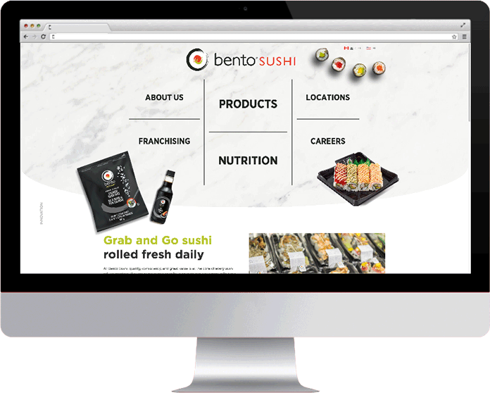
The Reshift design team created the sites templates, menus, components, and everything else with which I was to build from. After the client had approved these designs, I had to develop the final product to match the designs precisely. The client had several other unique requests as well:
- An interactive map containing locations markers of the stores
- Have components animate, or have a parallax feature
- Image sliders
- A product filter
- The capability to add an accordion component to pages
- A French and American version of the website
- The ability for their team to add any and all content
After looking over the designs, requests, and discussing any issues I had with my team, I was ready to begin.
Development

Helena had developed a starter package for me to work with containing the Sage starter theme and UIkit front-end framework. Being unfamiliar with these tools, I took time to look over their documentation to better understand how they function. Afterwards, I created a multi-site environment on my laptop via the very handy Flywheel application, installed everything in the package, and began to work. Development started in early December of 2018, and a soft launch of the site occurred on May 1st, 2019.
The scale and scope of the Bento Sushi site was easily the largest I’ve undertaken in my career. It was a little overwhelming at first, but breaking the tasks into smaller, manageable pieces helped a lot. I started with setting up the site footer and header, then proceeded to work on the body template of the home page, product page, career page, and so on.
Interactive Map
The interactive map, created by Reshift’s VP of Technology, is a plugin which is hardcoded into the template of the page via a shortcode and renders as an iframe. The basic functions of the plugin work well out of the box, but various adjustments and styling customization were necessary.
The map needed to include a location feature. Based off the user’s IP address, it detects where the user is browsing from, and loads the map from their general location. This was written in jQuery with the help of geoip-db.com.
Image Slider
The image sliders are based off of Master Slider – Responsive Touch Slider by averta. While the plugin comes with several templates, none of them matched exactly what the client wanted. I took the template that closely resembled the functionality and layout of the site designs and overwrote the templates default stylings.
Filtering Products
The product pages use two types of filters: a category filter, and a type filter.
The category filter uses the UIkit filter component to show or remove items based off the sub-category the item is under. Items not in the selected category quickly fade away, and the remaining products get recompile to the top of the container.
The type filter is a bit of custom jQuery mixed with the UIkit filter component. All type options are initially set to on. The user then selects the option type they wish to filter. The filter then instantly removes all items with that type, as well as any item with no special type. This is accomplished with jQuery listening for event clicks on the filter options, showing or hiding any item with that option type and no option type. UIkit then triggers an update to recompile items to the top of the container.
Accordion
The accordion uses the UIkit accordion component with the necessary styling applied. Giving the client the ability to implement this component within the content on the site came in the form of a re-useable shortcode. Well, more specifically, three shortcodes.
It starts with a shortcode to begin the accordion container. The next shortcode consists of a title and text attribute for the clickable title, and text content. The client can reuse this shortcode within the accordion component as much as they’d like. Finally, they close the container with the final shortcode.
Multi-Site

As noted earlier, setting up a the Canadian and America websites started when the local environment was deployed. The idea was the root URL would direct to the Canadian page, and a sub-directory would exist for the American site.
As with the interactive map, a watcher would check where the user is browsing from via their IP address. If an American was browsing the Canadian site, a small message would appear at the top of the page asking if they wished to go to the American page, and vice-versa.
The same process couldn’t be done with the French site, as the client wants to link any necessary page or product back and forth with the English site. This would have been a tedious nightmare if done this way. Enter the WPML plugin.
With the WordPress Multilingual plugin, I was able to create a subdomain specifically for the French site. The client was then able to take an English page and associate it with a French page, creating a link between the two websites. The user has the ability to choose between English, French, and even the American site with a toggle on the front-end of the site.
Content and the Client
The CMB2 plugin gives the Bento Sushi team the ability to add content without breaking the page template. Multiple meta fields are attach to the various custom templates. This allows the client to select the template they wish to use to develop the page. They then can add and change content on certain parts of the pages without the necessity of altering the theme or template code.
They also have a global site option tab in their WordPress back-end. For items that are universally the same across the site (i.e. social media link), the client fills out the proper fields on the site options page. This saves the client the tedious task of adding the same information on every template/page/post/etc.
Technical Specs
Bento Sushi launched with WordPress v5.1 as the CMS. The theme is based off the Sage v8 starter theme. The front-end framework uses UIKit v3, as well as the Javascript library jQuery v1.11.2. Sass and javascript is compiled using Gulp v3.9.1. There are also several essential plugins:
Gotham is the site’s font type, and Font Awesome Pro v5.5 is used through out the site as well.
The location map is built with Angular v7.0.2, utilizes GoogleMaps, and tested and complied with Angular-cli v.7.0.4.

All screen shots were captured on June 7th, 2019
Click here to view Bento Sushi