A.G. Skryp
A.G. Skryp is the personal website of Toronto web developer Andrew Skrypnyk, showcasing previous projects, and blogging about web related content.
Process
The process of building the theme (known as Version 9) took many years, many variations, and many different approaches, with the current design concept beginning around the fourth version. Details of the previous versions are written in my blog posts and can be read by clicking here and here.
For this version, there were a few requirements I gave myself:
- It is to be a WordPress website with a custom theme
- The theme layout is not to follow a typical header – body – footer template
- There’s to be a functional blog and search pages
- Specific pages showcasing a portfolio of work
- Must include some kind of animation
Design
The palette for A.G. Skryp uses primary colours found in nature (greens, blue, orange). The font is san-serif, thin, sharp, and soft white, while certain call-to-action and heading text being thick and bold. The site contains only one font type.
 The idea for the site structure is to have a fixed background image of my own creation, and have all the content scroll over it. The background is to be colourful and rather complex in contrast to the rest of the site, but not be distracting for the user browsing over the content.
Using the colour palette, I create a diagonal gradient containing a blend of each of the colours. I add a sense of texture and depth by brushing over the gradient with a white circular pattern in various sizes, opacities, and blurriness.
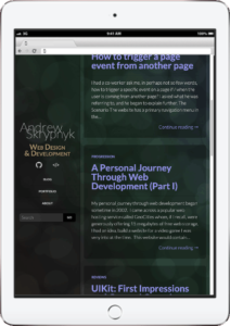
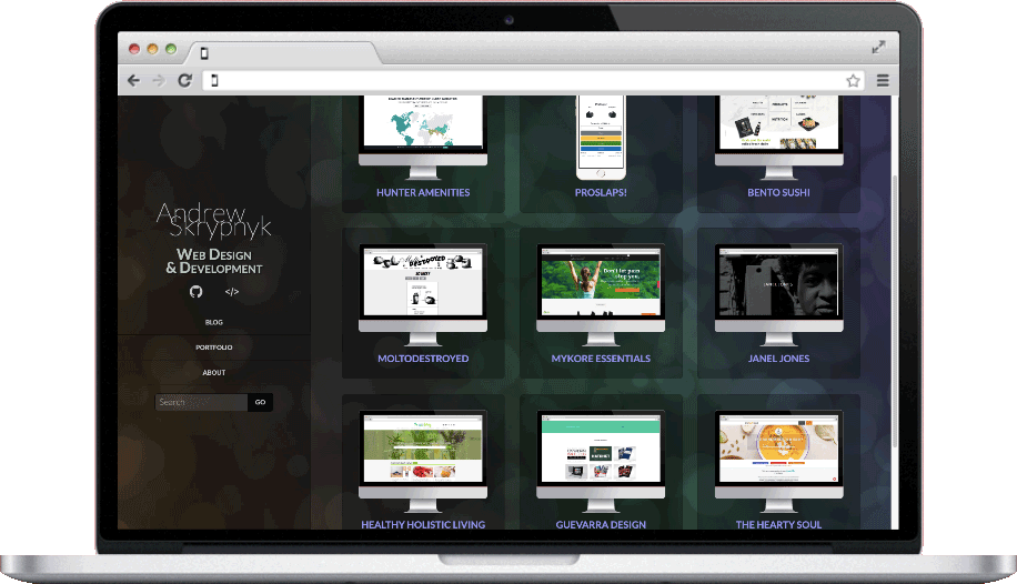
It took a bit of thinking and inspiration to come up with a site layout outside the norm. I’d decide on the header fixed to the left side of large devices, and the body + footer be scrollable on the right. The design breaks down to a standard fixed header at the top of the screen when the device is small enough.
This layout doesn’t apply to the home page, which acts as a site map of sorts. Large text displays the header and sub-header, and cards with info and links positioned underneath. All of this is in the absolute centre of large devices, and collapses to vertical rows on smaller devices.
Development
Initial development for Version 9 began in early June of 2018. Local development starts with setting up a hosting server using Vagrant. With the installation of a WordPress site, I download and activate the Underscores starter theme. A minified stylesheet of Bootstrap is also enqueue in the function file.
Some essential plugins include WP-SCSS by Connect Think to compile the sass into a single css file. Advanced Custom Fields by
Animation
The site contains two types of animations: TweenMax by GSAP, and CSS3.
 The front page is the only page using TweenMax. As such, a conditional statement in the functions file enqueues the TweenMax library and some custom javascript only on the front page of the site.
The animation works by targeting and timing certain elements. Starting with the heading sliding left and right while fading in unison. Next, the sub-header fades in one line at a time while sliding downwards. Finally, the description cards fade in one by one while shifting down as well.
While TweenMax is limited to the front page, the entire site has CSS3 animation running. The sub-header text rotates through the sites colour pallet. This happens by targeting the element and giving it the animation attribute with custom values including infinite to run on a continuous loop. Lastly, I set up keyframes and give each keyframe a different colour to cycle through.
Version upgrade
The first round of development on A.G. Skryp was complete in early August, 2018. Since then there’s been minor code touch up, tweaks, and plugin updates.
Around the end of May 2020, I revisited the site to simplify and revamp the theme. This involved doing many different things:
- Moving the local site from Vagrant to Flywheel
- Replacing WP-SCSS plugin and setting up a gulp file to run gulp-sass
- Switching Advanced Custom Fields and Custom Post Type UI with the CMB2 plugin
- Removing unused code and files from the theme
- Reducing jQuery and Bootstrap to just the essential scripts and styles.
- Optimizing the css to use similar classes and styles
- Using ajax calls to load more posts instead of having pagination
- Making various subtle style changes through out the site
Technical Specs
A.G. Skryp runs on WordPress v5.5.1. The theme is based off of the Underscores starter theme. The front-end framework uses Bootstrap Grid v4.2.1, and jQuery v2.2.1. Must use and general plugins include:
- Classic Editor v1.5
- CMB2 v2.7.0
- Contact Form 7 v5.2.2
- Litespeed Cache v3.4.2
- Show Current Template v0.3.4
- Yoast SEO v14.9
A.G. Skryp also uses Gulp v4.0.2 as a task runner. Necessary extensions include:
- gulp-autoprefixer v7.0.1
- gulp-sass v4.1.0
- node-sass v4.14.1
Font Awesome and Lato by Łukasz Dziedzic are the font and icons used through out the site.
All screen shots were captured on September 27th, 2020
Click here to view A.G. Skryp
